
I can create a variety of infographics and charts that illustrate complex financial, business or timeline information.
This Sankey diagram shows how nearly a billion dollars in federal recovery money flowed to various recovery projects over time. Sometimes the flow of recovery money changed over time. Example: the light blue tube at the center of the graph is much smaller on the left (the beginning) than on the right (the end). This reflects the fact that more money was needed than initially thought for new housing production after the Iowa floods of 2008.

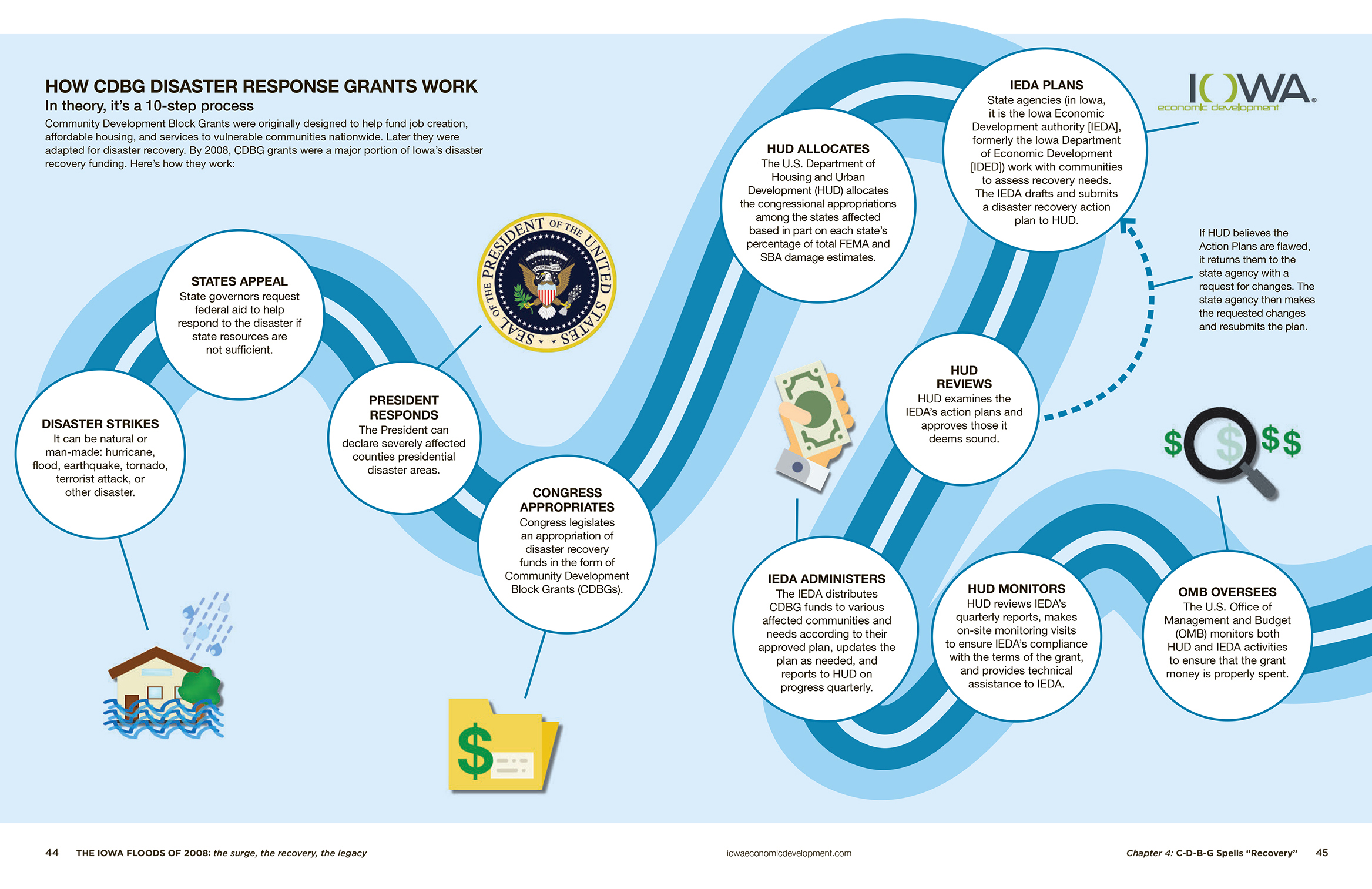
I can also create infographics that demonstrate moving through a process or through time. This flow graph shows the steps needed to implement a Federal disaster grant.
This graph shows how the flood recovery money spent in Cedar Rapids was divided between the different main categories (inner ring) and then the more specific categories (outer ring).
